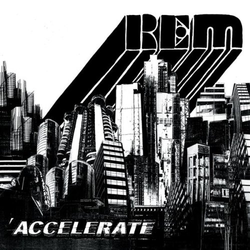
REM came out with a new album yesterday. No, that's not the weird part. The weird part is the album art. Check it out:

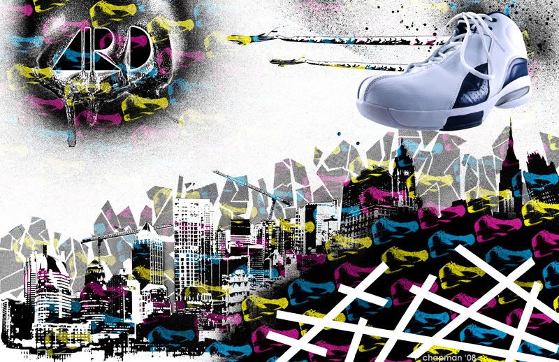
Looks pretty cool, right? Yeah, I think so, too. And I thought so back in January when I designed this:

Notice any similarities? I kinda do.
Now I'm not--I repeat, NOT--calling plagiarism on this. I'm not saying someone saw this and "stole my ideas" or anything like that. So don't think I'm on a quest for justice looking for some graphic designer somewhere or anything like that. I'm definitely not the first person to collage some skyscrapers, or to draw type like that. It just strikes me as weird/funny that the two designs are so similar (especially considering how close in time they were released). And maybe I'm overblowing how things get around on the Internet, but it certainly strikes me as interesting, at least, that this looks so much like the AIR D ad I made. Except better. Maybe it's a sign that I'm on a good track as a designer.
Maybe it's coincidence. It probably is. But what if? I just wish I knew how to look into things like this.
This'll probably keep me up tonight. Shoot.
By the way, I'm listening to the album right now, and it's really great, so I suggest you pick it up. My favorite track so far is Until the Day is Done.


No comments:
Post a Comment