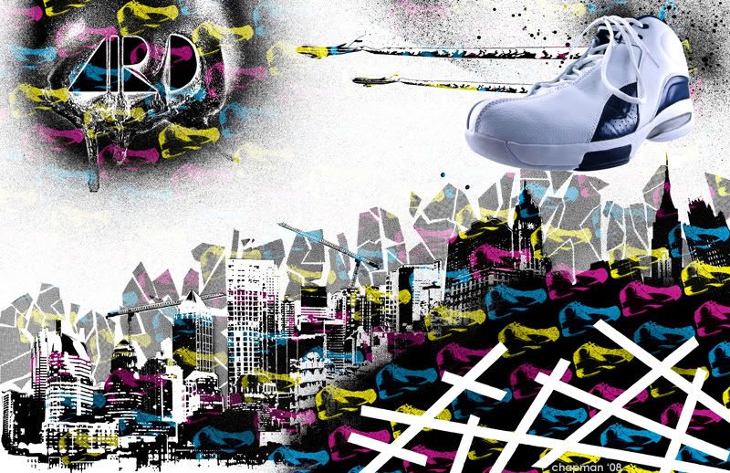
I've been working on this thing off-and-on since late December, and tonight I finally finished it. Hope you guys like:

I hope you're interested in hearing how I did it, because I'm going to tell you regardless. I wanted to make this as hands-on as possible; Ideally I would have done it 100% without the use of a computer, but that's extremely hard to do when you know going into it that it would be a lot easier if you did the whole thing digitally. So I made a compromise and did as much "analog" work as possible, and use photoshop for the stuff that would be too hard to do without it.
First I pulled a ton of stock photos of buildings off the Internet and then maxed out the contrast in Photoshop. Blerg! First step in and I'm already using a computer! Anyway, after that I printed the pictures, cut them out, and then pieced them together collage style on an 11x17 sheet of bristol art board. I cut out pieces of shading film I bought at an art supply store and then pieced those behind the buildings to make a cool background. After this step I sprayed all over the place with black and white spray paint, and used graphic design tape to create the bold white lines in the bottom right corner.
The logo in the top left was a happy accident, and I take no credit for coming up with it. I cut out the logo from another piece of art board with an x-acto knife and planned to just spray paint the stencil white on the big black spray. And I either didn't cut out the stencil right or the paint was the wrong consistency, but it just didn't work out when I tried spraying the logo on other pieces of test paper. All the paint just bled together. So I tried to stencil it again, this time with black spray paint, only to find out that the two wet paints just mixed together on the stencil in a big swirly mess, which had a really amazing, textured effect. So I just waited for the swirls to dry, scanned it and placed it in later digitally when I scanned the finished product.
The shoe photography is all me. Luckily I have access to a professional quality photography set up at my new job, so I was able to take super high quality photos of the shoes, which I tweaked a bit in Photoshop. I used a different photo for the background, which I cranked up the contrast on to make it flat black and white, which I later added cyan, magenta, and yellow color overlays to and created the alternating pattern for the background, which I later used more scans of spray paint spatters to add a dusted feel to the background.
And there you have it, the final product; all in all I'd say it's about 80% hand-made and 20% digital. Not a bad ratio. I can see some problems with it, but I had a blast experimenting with all the different media I used to pull the whole thing together. It's not perfect but I learned a hell of a lot from it, which is what counts most in my book. It'll also go into the old portfolio, too, so that doesn't hurt, either. Anyway, there it is, hope you guys like it.
Later.


No comments:
Post a Comment